Class Branding
Establishing a consistent church brand and design across your online spaces is a major factor in your members online experience. It increases your recognization, establishes trust, and makes your members feel connected to the church in an online environment. Because of this, OnArk comes with multiple branding options to help your classes feel like your website or app.
Icon
Uploading your church icon will allow your classes to display your churches favicon, which is the small icon that appears in your browser tabs.
The icon will also be used inside of your admin portal in the top-left corner to visually indicate the church your are currently logged into and editing.
Specs:
Aspect Ratio: 1:1
Dimensions: 100x100
Logo
Your logo will be displayed at the top of every class you publish. We recommend a rectangular logo to fit the space well, but a square or circle logo also work well for this space.
Specs:
Aspect Ratio: 3:1
Dimensions: 300x100
Colors And Styles
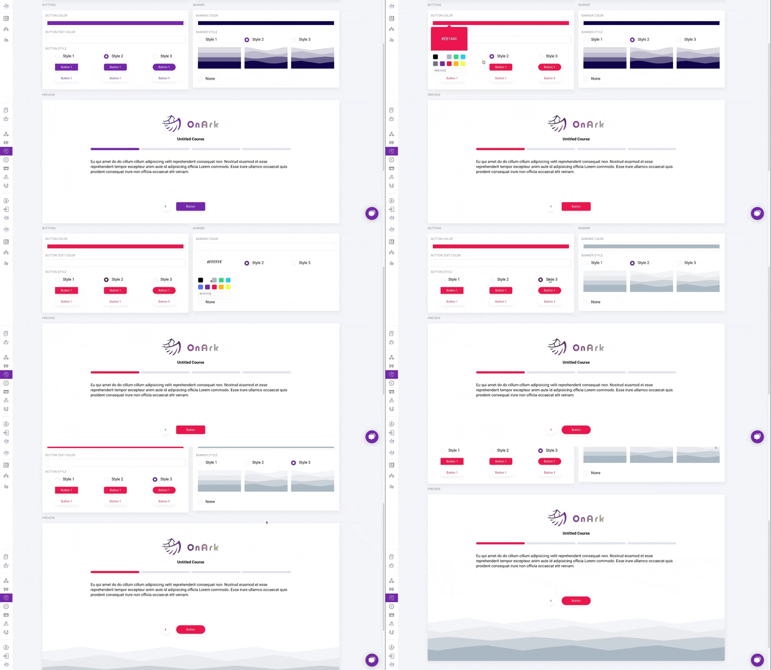
Brand the colors of your class to match your church by selecting the colors for your buttons and banner.
Then, choose the button and banner styles that match your church website or app designs.
As you select your options, you’ll notice them appear in real-time below in the previewer.
*Note - All changes are automatically saved when .


